<dashboard>
     <name>system-status-dashboard</name>
     <display>
         <label>System Status Dashboard</label>
     </display>
     <widget>
         ...
     </widget>
     <widget>
         ...
     </widget>
     ...
</dashboard>Dashboard Configuration
|
Since 4.2
This functionality is available since version 4.2.
|
Documentation about dashboards can be found at multiple places in docs. To avoid confusion, please see
-
Customizable Dashboards page provides configuration options information about this feature.
-
Samples are at samples/dashboard on Github.
-
Design notes for development of dashboards and reports can be found here.
This document describes details of configuration of dashboard and report that is generated from the dashboard.
Dashboard
Dashboard is configurable object in midpoint, providing basic information about state of Midpoint. Dashboard contains name, display with label and widget elements.
In 4.2 dashboards were shown automatically when defined. Since 4.3 there you have to define which dashboards should be shown in the left (sidebar) menu in system configuration. The configuration is show below:
|
Since 4.3
This functionality is available since version 4.3.
|
Configuration to show dashboard in the menu
<adminGuiConfiguration>
    ...
    <configurableUserDashboard>
        <identifier>admin-dashboard</identifier>
        <display>
            <label>Admin dashboard</label>
        </display>
        <configurableDashboardRef oid="00000000-0000-0000-0001-000000000001"/>
        <visibility>visible</visibility>
    </configurableUserDashboard>
</adminGuiConfiguration>
The example above shows how to configure dashboards to be shown in the left (sidebar) menu. Property display defines the name of the link which is shown in the menu. If it isn’t defined, the display property of referenced DashboardType is used. Property configurableDashboardRef is used to reference specific DashboardType. If it isn’t defined, midPoint ignores the whole configuration. For visibility settings, since 4.3 use visibility property in configurableUserDashboard instead of visibility in DashboardType.
We have two kinds of widgets, widget for objectCollection and widget for objectType.
Widget
Widget contains three basic configuration attributes display,data and presentation.
display
Attribute display contains configuration of the widget’s visual side in the GUI.
Possible configuration attributes of display:
| Name | Type | Description |
|---|---|---|
|
String |
Displayed name of Widget. |
|
String |
Default color of background for widget. |
|
String |
CssClass for widget icon for example "fa fa-user". |
|
String |
CssStyle for widget for example "color: #444 !important" for change of font color. |
data
Attribute data represents the data source that the widget displays.
We have two kinds of data:
-
for objectCollection
-
for objectType
Possible configuration attributes of data:
| Name | Type | Description |
|---|---|---|
|
DashboardWidgetSourceTypeType |
Type of widget content data source.
Specify type of input data, which midPoint use for generating message showed in widget.
This is enumeration type and possible values is objectCollection (content of widget is based on object collection), auditSearch (content of the widget will be based on data from object collection with filter for audit records) and object (content of the widget will be based on data from a single object). We describe using |
|
DashboardWidgetSourceTypeType |
This attribute is an identifier that override sourceType. We can use it for asynchronous widget.
This element is used only for number message showed in widget in GUI. Widget in GUI can contain link for redirect to details page and for it is still used sourceType. We describe using |
|
CollectionRefSpecificationType |
Specification of an explicit or implicit object collection that will be used as data source for the view. Contains variable collectionRef, which is reference to object collection is displayed in widget. |
|
ObjectReferenceType |
Specification of a single object as a widget data source. |
|
String |
Specification of a string data as a widget data source. This data can be stored by report task. Widget show it by using of asynchronous widget. |
Using sourceType and displaySourceType
When we want to use basic widget, so using directly sourceType as objectCollection, auditSearch and object.
The displaySourceType is important for asynchronous widget. We set widgetData as displaySourceType and we can set objectCollection as sourceType, this mean that widget show stored data from attribute storedData, but for link of details use sourceType. We can’t forget, that sourceType will also use by Export report task for generation storedData.
When we use source objectCollection or auditSearch, midPoint need reference to object collection which contains filter for data.
Example of widget data source for object collection:
<widget>
    ...
    <data>
        <sourceType>objectCollection</sourceType>
        <collection>
            <collectionRef oid="15de186e-1d8c-11e9-a469-8f5d9cfc0259" type="c:ObjectCollectionType"/>
        </collection>
    </data>
</widget>
We can define object as source, when we have to configure reference for object, which will be use as source. In next configuration we can define path for attribute, which widget will show.
Example of widget data source for object type:
<widget>
...
<data>
<sourceType>object</sourceType>
<objectRef oid="00000000-0000-0000-0000-000000000005" type="c:TaskType"/>
</data>
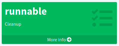
</widget>Widget from GUI with data source for Cleanup task and path for state attribute:
When we can use asynchronous widget, we use objectCollection, auditSearch or object as source, but we have to use widgetData as source for display.
Example of widget data source for widget data (asynchronous widget):
<widget>
...
<data>
<sourceType>objectCollection</sourceType>
<displaySourceType>widgetData</displaySourceType>
<collection>
<collectionRef oid="15de186e-1d8c-11e9-a469-8f5d9cfc0259" type="c:ObjectCollectionType"/>
</collection>
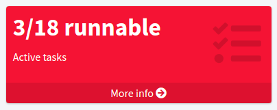
<storedData>25/25 runnable</storedData>
</data>
</widget>presentation
Presentation define how will be data presented. We define four basic kind of presentation:
-
percentage (50%)
-
separated with slash (5/10)
-
separated with "of" (5 of 10)
-
only value (5)
Presentation contains three attributes: dataField, variation and view.
dataField
First is dataField, which is properties of a specific widget data field.
Note that the order of dataField elements is NOT significant.
The field order is given by specific presentation style.
Attributes for dataField:
| Name | Type | Description |
|---|---|---|
|
DashboardWidgetDataFieldTypeType |
Type of the field.
We support values |
|
ExpressionType |
Expression that produces value to display in the widget. |
For fieldType value, we define new type of expression ProportionalExpressionEvaluatorType proportional with attribute style. Variable style is enumeration type with values percentage (for example 50%), value-slash-domain (for example 5/10), value-of-domain (for example 5 of 10) and value-only (for example 5).
variation
Next presentation attribute is variation. Conditional variation in the way how the widget is displayed.
Variations may change colors or icons of the widget based on a condition.
Attributes for variation:
| Name | Type | Description |
|---|---|---|
|
ExpressionType |
Condition for the variation. The variation will be active if the condition evaluates to true. |
|
DisplayType |
Display properties to apply in case that the condition is true. Those display properties specify only those presentation aspects that are different from the usual presentation. This is supposed to be merged with the primary display properties of the widget. E.g. if the variation only changes widget color, only color needs to be specified here. Icon and other styles are taken from the primary widget display properties. |
condition can get four variables:
| Name | Type | Description | sourceType in data of widget |
|---|---|---|---|
|
IntegerStatType |
Integer stat (statistic) entry. This entry contains stat value, together with domain value. |
objectCollection, auditSearch |
|
Collection<String> |
Collection of policy situations. |
objectCollection |
|
base on displayed object in widget |
Processed object. |
object |
|
String |
Stored data from widget. |
widgetData |
view
Last variable of presentation is view, this variable is processed for report and we will look on it below.
Example of presentation:
<widget>
    ...
    <presentation>
        <dataField>
            <fieldType>value</fieldType>
            <expression>
                <proportional xmlns:xsi="http://www.w3.org/2001/XMLSchema-instance" xsi:type="c:ProportionalExpressionEvaluatorType">
                    <style>percentage</style>
                </proportional>
            </expression>
        </dataField>
        <dataField>
            <fieldType>unit</fieldType>
            <expression>
                <value>up</value>
            </expression>
        </dataField>
        <variation>
            <condition>
                <script xmlns:xsi="http://www.w3.org/2001/XMLSchema-instance" xsi:type="c:ScriptExpressionEvaluatorType">
                    <code>
                        policySituations.contains("#resourceHealthDanger")
                    </code>
                </script>
            </condition>
            <display>
                <color>#dd4b39</color>
            </display>
        </variation>
    </presentation>
</widget>
Object Collection
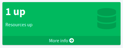
You can see basic configuration for objectCollection on Object Collection. For dashboard, we can use policyRule with policyTreshold for define some policySituation. Example of object collection for resource, which have status UP:
<objectCollection xmlns="http://midpoint.evolveum.com/xml/ns/public/common/common-3"
                                  xmlns:q="http://prism.evolveum.com/xml/ns/public/query-3"
                                  xmlns:c="http://midpoint.evolveum.com/xml/ns/public/common/common-3"
                                  oid="15de186e-1d8c-11e9-a469-8f5d9cfc0259">
    <name>Resources Up</name>
    <assignment>
        <policyRule>
            <policyConstraints>
                <collectionStats>
                    <collection>
                        <interpretation>explicit</interpretation>
                    </collection>
                </collectionStats>
            </policyConstraints>
            <policySituation>#resourceHealthDanger</policySituation>
            <policyThreshold>
                <highWaterMark>
                    <percentage>99.9</percentage>
                </highWaterMark>
            </policyThreshold>
        </policyRule>
    </assignment>
    <type>ResourceType</type>
    <filter>
        <q:equal>
            <q:path>operationalState/lastAvailabilityStatus</q:path>
            <q:value>up</q:value>
        </q:equal>
    </filter>
    <domain>
        <collectionRef oid="00000000-0000-0000-0001-000000000006" type="c:ObjectCollectionType"/>
    </domain>
</objectCollection>
Variable domain is a set of object that is "all the things" for this collection. For example collection of "up resources" will have a domain "all resources". In this example we use policyRule with policySituation, which we can check in variation of widget presentation. When policyTreshold is met policySituation from policyRule is presented in variation. policyThreshold have two important variables for us, lowWaterMark and highWaterMark.
lowWaterMark is lower bound of the threshold. Lowest value for which the policy rule is activated. The policy rule will be triggered for all values starting from this value up until the high water mark (closed interval). If no low water mark is specified then the policy rule will be activated for all values up to the high water mark. Policy rule with a threshold that does not have any water marks will never be activated.
highWaterMark is upper bound of the threshold. Highest value for which the policy rule is activated. The policy rule will be triggered for all values starting from low water mark up until this value (closed interval). If no high water mark is specified then the policy rule will be activated for all values that are greater than or equal to high water mark.
Both variables are WaterMarkType type, which contains variables count and percentage.
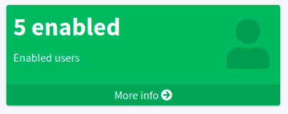
Simple example for "enabled users widget"
Now we show very simple example for widget of enabled users, that show only number of enabled users in mP.
As first, we create object collection with filter for users with value enabled in attribute activation/effectiveStatus.
<objectCollection oid="00000000-0000-0000-0001-000000147896">
   <name>All enabled users</name>
    <type>UserType</type>
    <filter>
        <equal>
            <path>activation/effectiveStatus</path>
            <value>enabled</value>
        </equal>
    </filter>
</objectCollection>
And next we create dashboard with one widget for enabled users.
<dashboard oid="f89709f9-7313-494f-a600-69ea75d95106">
    <name>Example one widget for enabled users</name>
    <display>
        <label>Enabled users</label>
    </display>
    <widget>
        <identifier>enabled-users</identifier>
        <display>
            <label>Enabled users</label>
            <color>#00a65a</color>
            <icon>
                <cssClass>fa fa-user</cssClass>
            </icon>
        </display>
        <data>
            <sourceType>objectCollection</sourceType>
            <collection>
                <collectionRef oid="00000000-0000-0000-0001-000000147896" type="ObjectCollectionType"/>
            </collection>
        </data>
        <presentation>
            <dataField>
                <fieldType>value</fieldType>
                <expression>
                    <proportional>
                        <style>value-only</style>
                    </proportional>
                </expression>
            </dataField>
            <dataField>
                <fieldType>unit</fieldType>
                <expression>
                    <value>enabled</value>
                </expression>
            </dataField>
        </presentation>
    </widget>
</dashboard>
You don’t forget add new dashboard to admin gui in system configuration and relogin for showing it in left sidebar menu. After opening of new dashboard in GUI you can see our new widget.
Asynchronous widget
From 4.4 Midpoint support asynchronous widget. When we want to configure it, then we use displaySourceType in widget and set it as widgetData. We set sourceType as objectCollection because of redirect to details page and task, which generate stored data.
We need configure dashboard report task, which will be store data to widget. In dashboard report use element storeExportedWidgetData for defined where will be stored generated widget data.
For example, we use same case as previous example for enabled users. We create same object collection.
<objectCollection oid="00000000-0000-0000-0001-000000147896">
   <name>All enabled users</name>
    <type>UserType</type>
    <filter>
        <equal>
            <path>activation/effectiveStatus</path>
            <value>enabled</value>
        </equal>
    </filter>
</objectCollection>
As next, we create dashboard with one changes. We add attribute displaySourceType with value widgetData.
<dashboard oid="f89709f9-7313-494f-a600-69ea75d95106">
    <name>Example one widget for enabled users</name>
    <display>
        <label>Enabled users</label>
    </display>
    <widget>
        <identifier>enabled-users</identifier>
        <display>
            <label>Enabled users</label>
            <color>#00a65a</color>
            <icon>
                <cssClass>fa fa-user</cssClass>
            </icon>
        </display>
        <data>
            <sourceType>objectCollection</sourceType>
            <displaySourceType>widgetData</displaySourceType>
            <collection>
                <collectionRef oid="00000000-0000-0000-0001-000000147896" type="ObjectCollectionType"/>
            </collection>
        </data>
        <presentation>
            <dataField>
                <fieldType>value</fieldType>
                <expression>
                    <proportional>
                        <style>value-only</style>
                    </proportional>
                </expression>
            </dataField>
            <dataField>
                <fieldType>unit</fieldType>
                <expression>
                    <value>enabled</value>
                </expression>
            </dataField>
        </presentation>
    </widget>
</dashboard>
Finally, we create report for dashboard.
<report>
    <name>Enabled users report</name>
    <assignment>
        <targetRef oid="00000000-0000-0000-0000-000000000170" type="ArchetypeType"/>
    </assignment>
    <dashboard>
        <dashboardRef oid="f89709f9-7313-494f-a600-69ea75d95106" type="DashboardType"/>
        <showOnlyWidgetsTable>true</showOnlyWidgetsTable>
        <storeExportedWidgetData>onlyWidget</storeExportedWidgetData>
    </dashboard>
</report>
Now we can run report and midPoint processes source data from dashboard and resulted data writes to widget in dashboard. During next showing of widget in GUI midPoint doesn’t process source data but only show savedData from xml. We can see same result.
View
When we create new dashboard, than we can see it in midpoint gui. Next screenshot is displayed dashboard-system-status.
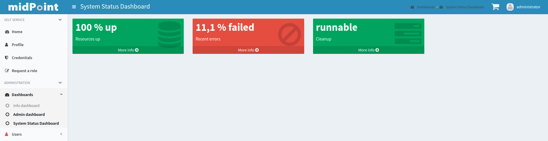
For whole sample please see dashboard-system-status.
Was this page helpful?
YES
NO
Thanks for your feedback